


FORECASTS ARE ONLY ONE TOOL IN THE KIT

Hello and thanks for reading this week’s No Straight Lines Investments blog, I really appreciate your time and attention.
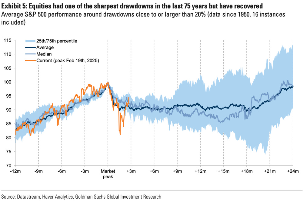
Rather than simply pointing out that the S&P 500 is now up 1.3% ytd after 5 straight green days, I prefer this chart - it highlights 16 drawdowns in the ~20% range since 1950, offering real historical context for the current price recovery in the index. (Chart as of May 14; excludes Thursday/Friday rally)
My initial takeaway is that every drawdown/recovery is unique, just take a gander at the width of the baby blue area.
Consider this: even if you had the rare combination of foresight and luck to exit near the February 19 peak, the window to re-enter before the recovery took off was incredibly narrow.
And to humbly remind everyone, I did NOT sell my positions and was carrying a LOT of freight into the sell off!
Subsequent events effectively validated the sell everything decision, culminating in the now infamous Rose Garden tariff announcements.
In no particular order, the flow of information post Liberation Day went like this:
top down strategists adjusted targets on the indexes downward, bottom up analysts negatively revised estimates and targets on individual company estimates and economists downgraded growth forecasts
market technicians mostly became bearish on the “setup”
investor sentiment plummeted to near record levels of pessimism
professional investors skewed portfolio positioning defensively and the retail crowd kept putting $$ to work
Would any of these bullet points be an impetus to jump back into the market?!
Last week I attempted to breakdown some of the drivers of the rally. I called it an autopsy because it was done AFTER the fact, when the outcome was already known.
Fast forward to this week post the de-escalation with China and the AI investment announcements from Saudi Arabia, and what happened??
If you would like to continue reading, please subscribe for $20/month
Thanks for reading and best of luck with your investments this week!
This week I highlight portfolio holdings in #energy, #bitcoin/HPC and #software.
My charts of the week is a curated selection of stock specific and macro pictures that I believe best capture the stock market narrative of the past week.
I hope you sign up!
As a teaser, my biggest portfolio position is an industrial stock which has the potential to double if it’s multiple moves to reflect only 1/2 of it’s backlog-based growth. Even if the multiple doesn’t move, the stock should appreciate by it’s growth of 30% over the next 2 years.
You can follow me on X (@NSLInvestments), LinkedIn: Jonathan Lansky, or using the Substack app chat feature.